Wednesday, July 31, 2013

My new garlic keeper


Tomorrow I'm off to Atlanta for the Haven conference (eeeeek!), but I thought I'd pop in quickly today to share a little project I've just been working on.

I really enjoy cooking and do so A LOT.  Well, I try too, anyway.  Sometimes the lure of some no effort carry out pizza is just too much for me to resist at the end of a long day.  In an attempt to make myself cook as often as possible, I try to keep my kitchen pretty well equipped.  I have my beloved cornflower blue Kitchenaid stand mixer, my fabulous cast iron dutch oven, my Cuisinart food processor, and several other fun and useful things.  I love them all!  Mind you, I've been very slowly accumulating those things over the course of several years of birthdays and Christmases.  Living on a budget doesn't allow for lots of expensive gadgets all at once, after all. :)

One thing I've been wanting to add to my kitchen collection for quite some time is a garlic keeper.  Such a little thing, but it can make a big difference in the longevity of a bulb of garlic.  It's very, very depressing to be in the middle of cooking dinner and discover that my garlic is all dried and shriveled.  Boo!  Garlic keepers can help prevent that from happening, so I've been on the hunt for one.  There are tons of really cute options on the market, like this one from Amazon:


How cute is that?  I love it, but don't feel like dropping $10 on it.  After thinking about it for a bit, I came up with a way to make my own garlic keeper for cheap cheap cheap.  A bunch of the keepers I've seen around the interwebs are made from terra cotta, and they all have holes in them to let the garlic breath.  See where I'm going with this?


Ta da!  A $0.79 terracotta pot with a $0.19 saucer!  (Please disregard the stains on my counter.  They're beyond my ability to clean.)  Right material, perfect size, and it even has a vent hole.  I was so happy when I got this idea.  It works perfectly!  It's a little plain, though, so I grabbed some paint and took care of that problem. :)

I've long loved the gorgeous white patina terracotta gets with age and weathering.  Look at these from Etsy.  Absolute perfection.


I used some Pure White ASCP to try to replicate that look, since it's so easy to apply and to work with after it's dry. I used my finger to apply a good base coat, and after that I used a brush to apply a second, more opaque coat.  Once all the paint was dry, I hit the edges and a few key spots with some 150 grit sandpaper, and this is my final result!


I love how the totally matte texture of the Chalk Paint looks just like the flaky whiteness that develops naturally on this clay.  I didn't paint the interior of the pot, since that'll be touching the garlic and no one but me ever sees it.  Chalk Paint is about as safe a paint as you can get, but I'd still avoid getting it allover your food if you can help it. ;)


So there you go!  A super cheap, super quick and useful project for your weekend enjoyment.  Now, go make yourself a garlic keeper!

Saturday, July 27, 2013

Our New Butterfly Wall Chart


Well, hello there.  Thanks so much for dropping by!  Today we'll be studying...butterflies!  I love butterflies.  Don't you?  The zinnias the kids and I plant each year are a positive magnet for butterflies, and we love to sit on our sweltering little screen porch and watch them flutter around. 

With all the butterfly goodness going on outside, I was ready to bring a bit of it inside.  One of my very favorite trends on Etsy (and elsewhere, but that's where I spend a lot of my time, after all), is the gorgeous old natural history and vintage school wall charts that have been popping up.  I just can't get enough of them.  Here's one of the vintage butterfly charts from Etsy that has my drooling:


Isn't that fabulous?  Sadly, though, that price tag ($110!) is well outside my discretionary decorating budget.  The vintage ones all run in that sort of price range, so I obviously had to DIY something if I was going to have one of my own.  After a bit of looking online, I stumbled across Cavallini & Co.'s large single sheets of wrapping paper.  Oh my goodness, how have I not seen these before?  They're incredible!  I bought the butterfly one (naturally) through Amazon and it was only $5.  (Unfortunately the Amazon seller I bought mine from seems to be sold out, but you can get the poster here, too.)  I can't imagine anyone actually using them as wrapping paper, really.  Mine is 20x28 inches and it's printed on gorgeously textural Italian paper.  Seriously, who would fold something like that up and put tape on it?  (I suppose I did end up putting glue on mine, but that's beside the point)

Poster in hand, I went about finding some wood to use for the roll-y bits at the top and bottom.  Do those things have a name?  Let's just keep going with roll-y bits, shall we?  I didn't want to use round dowel rods because they would have been way too hard to attach to the poster.  Lots of fiddly effort = not what I wanted for this project.  At Michael's this afternoon I picked up a couple of 1/2"x1/4" flat pieces of wood that worked beautifully.  The 1/4" thickness gives the sticks a nice weight, which I thought would help the poster stay flat when hanging.

Each piece was 24 inches long, so I cut them down by 2 and 1/2 inches before I stained them.  The plain blond wood wouldn't have looked right with the vintage-y poster, so grabbed some stain from my stash and got started.  Let me pause here to say how glorious our Habitat ReStore is.  I picked up a whole bunch of little cans of barely used Minwax stain for $1 each.  Every single staining project I've ever done has been accomplished with those little cans, from my IKEA hack tv table  to the antique desk I restored.  I'm such a hoarder, I can't imagine ever getting rid of almost full cans of anything, but I sure am glad someone else did!

Ok, enough digression!  After a quick sanding just to smooth the sticks out a bit, I used the Dark Walnut stain.  I like that this color doesn't have much red, and since I wanted a straight brown this stain worked perfectly.


Cardboard boxes work wonderfully as a work surface, by the way.  I was way too impatient to wait the full 24 hrs drying time on the stain, so I coated the sticks with some Polycrylic sealer after 2 hrs.  I can't recommend this course of action, since you're supposed to wait a whole day, but I can't be bothered with that.  Once I had finished with the wood prep, I did a quick dry fit of the sticks before gluing them to the top and bottom of my poster.


As you can see, I used whatever was around to weigh down the sticks as the glue dried.  I wanted to be sure the poster was totally flat before I hung it so that it would look more like a chart than a poster.  To create a hanger for the poster I just glued a bit of jute twine to the back of the poster and top stick.  Such a simple project with a huge payoff!


Isn't it fantastic?  It's the perfect butterfly addition to our living room, and the kids love it, too.  Our other favorite screen porch activity is watching birds at our feeder, and I'm hoping to do something similar with a bird poster on the other side of the room.  I'll let you know how that turns out when I get around to it.  In the meantime, though, here are the butterflies in their permanent home:


Sorry, the light in there is terrible.  But you get the idea!  It makes such a happy addition to the room.  Hope you like this little project!

Linking up here:

Give Me The Goods Party at So Much Better With Age

Wednesday, July 24, 2013

The Ultimate Market Tote!


Hi friends!  Today I wanted to share the newest creation for my Etsy shop, and man am I excited about it.  I know I've mentioned it before, but in case you missed it, I'm headed to the Haven Conference next weekend.  It's a blogging conference for DIY bloggers and I am so thrilled to be going!  I've been wanting a new tote bag to carry a notebook, business cards and maybe a little conference loot, and I was thinking something a bit larger than my regular purse would be great.  To that end, I hit the drawing board (well, really just our dining room table) to design a new bag!

I've always loved the ruffled ticking market tote I already have available in my shop, so I decided to do something similar for the new one.  I based the size on my favorite Restoration Hardware tote because it's roomy without screaming, "I'm a crazy bag lady and I plan to take each and every freebie in this entire room so all the rest of you better clear a path before I trample you."  I don't want to scare away the other bloggers too quickly.  I'm already probably going to be all "Hi, I just met you and I'm nervous so here's all the the personal information I can possibly blurt out," anyway, so I think I'll try to at least look put together.  We all know it's just a ruse, but shhhh, they don't need to know that!


Oooook, back to the bag.  For this one I went with the more neutral tan ticking stripe, since that goes with pretty much everything I own.  In the shop, though, I'm making it available in any of my 3 ticking colors (this tan, navy, or red).  I really, really love working with ticking cotton for several reasons.  Its stripes make a great graphic statement, it can fit in with tons of different design schemes, but most importantly for this bag, it holds up beautifully to lots of use.  Seriously, this stuff is sturdy!  The ones I use are about the same weight as an 8 oz drop cloth.  Maybe just a tad lighter, but not much.  Perfect for a well-used tote bag, in other words!

Now, like I said, I already have a ruffled ticking strip tote bag available in my shop, so I needed to differentiate the new one from the original.  One thing my smaller tote doesn't have is a lining, which I knew I wanted in this one.  Rather than the typical muslin lining, I went with a gorgeously textural oatmeal-colored pure linen.  I absolutely adore this fabric!  Just like the ticking material, it wears really well and stands up to heavy use.  It's soft, too, which is nice for the inside of a purse!  Just to add another layer of goodness to the inside of the bag, I added a pocket on either side of the interior, too.


Isn't that linen beautiful?  I love it.  Another feature that I added to this bag (but that you can't see) gives it a huge boost in sturdiness.  I used a heavy duty iron-on stabilizer to add a ton of extra heft to the ticking material.  ()A stabilizer is basically just another layer of material that can be permanently fused, with the heat of an iron, to whatever fabric you're using to give it added strength and stiffness.)  It's so sturdy now that the bag can stand up unsupported!  For a tote bag that I plan to stuff fairly full, that's a really big bonus.  Also, as with all my pillow covers and totes, all interior seams (including those you can't see) are serged for nice clean edges and another layer of added durability.  Each handle is also made with a layer of stabilizer sandwiched in between 2 layers of the ticking cotton.  This bag can take a beating!


Who wants to have a tote bag if it isn't pretty, though?  Not me, thank you very much!  That's why I added the ruffle. :)  I love ruffles; they always make me smile.  They give this bag so much personality, too.  Just imagine it without the ruffles for a minute.  The fabric's stripes still give it a nice look, but I think the ruffles put it over the top in the awesome department (if I do say so myself!).


The ruffle's big, too.  Five inches from top to bottom, actually.  I thought about doing 2 rows of smaller ruffles, but I'm really happy I went with one big one.

So what do you think?  Do you like my ruffly new tote?  It's available in my shop now (view it here!), so if you're looking for a fun gift (think Christmas...), I'd be delighted to make you one!  Really, this bag has it all.  I'm just pleased as punch with how it turned out.  Here's one more beauty shot for the road, complete with my chalk-drawn flowers and baguette (don't laugh).


Thanks, as always, for stopping by! :)

Monday, July 22, 2013

Seafood, anyone?


Hello hello!  Can you believe July is more than halfway over?  I certainly can't.  It's been a wild month, and I'm so sorry I haven't been able to pop in here more!

Now that all the traveling craziness has settled down for a while (although I'll be on the road again to the Haven Conference in less than 2 weeks!) and our church's VBS is over, I had the chance to do a quick project this week that I thought I'd share today.

Waaaaaaay back when we moved Lily into a twin bed, we bought a big piece of 3/4 inch plywood to serve as a base for her mattress (the box spring made the bed too tall).  Stephen just went with an uncut piece and cut it to the right size when he got home, which left several feet of leftover wood.  Naturally, I decided to make a vintage-y sign with a little of it.  I mean, what else would any sensible woman use leftover plywood for?

I've been wanting to make a sign for my kitchen for a while, so that's where I knew this one would land.  I just love the look of all the vintage signs I've seen popping up around the kitchens of blogland.  They give even the most bland spaces a shot of unique character, which is something my deeply bland space could definitely use!  With the sign's future home in mind, I went with a food theme.  Specifically, seafood!  I love me some sea, some food, AND some seafood, so what could be better, right?

Ok, enough preamble!  Let's get down to the nitty gritty of how I made this baby.  If you've been around for a while, you may remember the sign I made for our master bedroom.  Yeah, I'm never using that insanely painstaking method EVER AGAIN if I can possibly help it.  Which I can.  So I'm not.  Anyway, I knew i needed to go a different route for this project, so after a bit of research I settled on the carbon paper method.  That's what Marian over at Miss Mustard Seed used to make her beautiful "Dairy" sign.  The only problem is that, well, I don't have any carbon paper.  But we all went to elementary school, right?  Remember when you used to color all over the back of a piece of paper with pencil, flip it over, and then draw a picture that would transfer to the surface below?  No?  Just me?  Moving on.


After choosing my fonts (my favorite part of any sign-making project) and fiddling around with their sizing a bit, I printed them out and filled in the entire backside with lots of pencil lead.  After taping them down, I simply traced over the lettering and this is what happened:


Ta da!  Perfectly transferred lettering with no X-acto knife purgatory and without having to go buy carbon paper!  (By the way, if you were transferring your lettering to a darker surface, you could do the same thing I did here but use chalk on the back of your letters instead.)  I love cheating the system.

With this sign in mind, I made a trip to our neighborhood Ace hardware to grab some paint samples in the colors I wanted.  I guess nobody was buying their little premixed paint pots, because they marked them down to $2 earlier in the summer.  Well, when I got there they'd marked them down AGAIN, this time to $1 each!  What?!  I'll take 8 of them, thanks.  Seriously, I bought 8.  I can't believe they were so cheap!  These little babies will last me for ages!

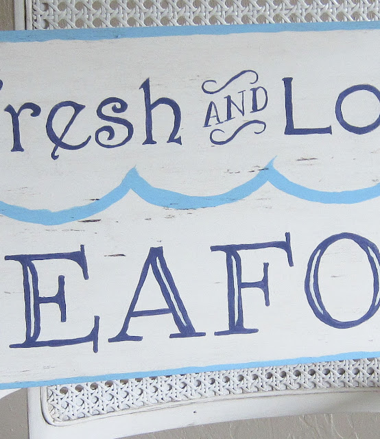
With my socheapIfeltlikeIstolethem paints in hand, I filled in my lettering with a nice dark blue (which looks much brighter here, for some reason).  After that I did a quick border and series of freehand waves in a really beautiful aqua color.


Great colors, huh?  I was lovin' the sign at this point, but decided to try a little dark wax to age it a bit.  Really, really terrible idea.  It just ended up looking dirty.  I think I'm officially retiring my dark wax.  I just can't get the hang of it!


Depressing, huh?  I did a little toddler-style foot stamping, and then just re-did the whole thing.  This time, though, I used my trusty Valspar Antiquing Glaze to age it.  I mostly used it to highlight all the great texture in the wood, rather than making the whole thing look darker.


See how wonky my painting looks up close?  I consider that to be my signature "I'm incapable of holding my hand steady" style.  Please contain your jealousy.  We can't all be as perfect as me.

So, that's my new sign!  Do you like it?  I'm super excited about how it finally came together.  I've been known to have to redo entire projects from time to time, so it didn't actually phase me all that much.  Just a part of DIY process.  Don't get discouraged if a project doesn't turn out just how you were hoping.  You can always try again!


Oh, and here's a quick shot of it in its permanent home in our kitchen.


Mmm, popcorn ceiling.  Let's just ignore that shall we?  That door leads out to the laundry room, but I'm not showing you that.  It's much, much too embarrassingly messy and cat litter-y in there.

The sign looks cute there, though, right?  I hope you get the chance to make a fun sign of your own!  It's easy and fun!  Do it, I say!

**I'm linking this post up with the Inspiration Exchange over at Ella Claire this week.

Monday, July 1, 2013

Simple beauty


Does beauty ever stop you in your tracks?  Has something seemingly insignificant ever taken your breath away with its simple perfection?  The ability to see beauty in the mundane is one of the things I'm trying hardest to instill in my children.  While we were in Michigan visiting my parents last month, we stopped by a petting farm.  I delighted in seeing my kids, James in particular, revel in the beauty of the place.  Where some might see an uncomfortably bumpy dirt road and some muddy puddles in the picture above, my kids and I see a road to adventure and new places to explore.  That fact is something for which I'm so very grateful.


One of my favorite things to do with Lily and James is go on what we call "nature adventures" in our backyard.  Our yard is nothing particularly spectacular, just a good sized patch of sparse grass that backs up to deep woods, but we can spend hours getting down near the ground or up close to tree trunks exploring the tiny ecosystems that thrive in our little bit of the city.  I hope and pray that these times will stick with them both throughout their lives, and help them keep a sense of wonder about even the tiniest of God's creations.


The only drawback to this perspective, however, is my vast capacity to want to care for and keep any and all animals that comes across my path.  If left to my own devices, my home would be so filled with pets that there wouldn't be space for the humans in my life.  Thankfully, God gave me Stephen, who is particularly adept at reigning in my pet-acquiring propensities.  He has a very simple method: he just says no. ;)

The other day, James was looking out our front windows and shouted that he saw a baby goat in our front yard.  In the 1.5 seconds it took Stephen to get there and say that it was, in fact, a wild turkey (still pretty cool), this is what went through my head: "A BABY GOAT!?!?  THEY'RE SO CUTE!!!  It must be lost.  I GET TO KEEP IT!!!!"  I'm serious.  I was halfway out of my chair getting ready to run outside and scoop up my new baby goat before Stephen corrected James's (totally bizarre) mistake.  While it's pretty sweet that we have a wild turkey living around our house (we saw her in our backyard the next day, too), it wasn't nearly as exciting as the prospect of having a baby goat of my very own. 


While wanting to keep every animal I see isn't an ideal personality trait, I think (and hope) it's a reflection of my intentional attitude towards nature.  I want to see beauty in the everyday.  Those brief hours we spent at the farm left me feeling so renewed.  Beauty grows on farms, and visiting them brings me such joy.  Though on a much smaller scale, that's what I'm trying to capture for my children in our explorations of our yard.  Beauty can be found in the tiny and insignificant just as easily as in the greatest works of art. 


Here's to finding beauty in the simple things, and bringing up children who can appreciate the awesome creation that is a baby goat!