Hello hello! Can you believe July is more than halfway over? I certainly can't. It's been a wild month, and I'm so sorry I haven't been able to pop in here more!
Now that all the traveling craziness has settled down for a while (although I'll be on the road again to the Haven Conference in less than 2 weeks!) and our church's VBS is over, I had the chance to do a quick project this week that I thought I'd share today.
Waaaaaaay back when we moved Lily into a twin bed, we bought a big piece of 3/4 inch plywood to serve as a base for her mattress (the box spring made the bed too tall). Stephen just went with an uncut piece and cut it to the right size when he got home, which left several feet of leftover wood. Naturally, I decided to make a vintage-y sign with a little of it. I mean, what else would any sensible woman use leftover plywood for?
I've been wanting to make a sign for my kitchen for a while, so that's where I knew this one would land. I just love the look of all the vintage signs I've seen popping up around the kitchens of blogland. They give even the most bland spaces a shot of unique character, which is something my deeply bland space could definitely use! With the sign's future home in mind, I went with a food theme. Specifically, seafood! I love me some sea, some food, AND some seafood, so what could be better, right?
Ok, enough preamble! Let's get down to the nitty gritty of how I made this baby. If you've been around for a while, you may remember the sign I made for our master bedroom. Yeah, I'm never using that insanely painstaking method EVER AGAIN if I can possibly help it. Which I can. So I'm not. Anyway, I knew i needed to go a different route for this project, so after a bit of research I settled on the carbon paper method. That's what Marian over at Miss Mustard Seed used to make her beautiful "Dairy" sign. The only problem is that, well, I don't have any carbon paper. But we all went to elementary school, right? Remember when you used to color all over the back of a piece of paper with pencil, flip it over, and then draw a picture that would transfer to the surface below? No? Just me? Moving on.
After choosing my fonts (my favorite part of any sign-making project) and fiddling around with their sizing a bit, I printed them out and filled in the entire backside with lots of pencil lead. After taping them down, I simply traced over the lettering and this is what happened:
Ta da! Perfectly transferred lettering with no X-acto knife purgatory and without having to go buy carbon paper! (By the way, if you were transferring your lettering to a darker surface, you could do the same thing I did here but use chalk on the back of your letters instead.) I love cheating the system.
With this sign in mind, I made a trip to our neighborhood Ace hardware to grab some paint samples in the colors I wanted. I guess nobody was buying their little premixed paint pots, because they marked them down to $2 earlier in the summer. Well, when I got there they'd marked them down AGAIN, this time to $1 each! What?! I'll take 8 of them, thanks. Seriously, I bought 8. I can't believe they were so cheap! These little babies will last me for ages!
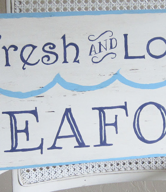
With my socheapIfeltlikeIstolethem paints in hand, I filled in my lettering with a nice dark blue (which looks much brighter here, for some reason). After that I did a quick border and series of freehand waves in a really beautiful aqua color.
Great colors, huh? I was lovin' the sign at this point, but decided to try a little dark wax to age it a bit. Really, really terrible idea. It just ended up looking dirty. I think I'm officially retiring my dark wax. I just can't get the hang of it!
Depressing, huh? I did a little toddler-style foot stamping, and then just re-did the whole thing. This time, though, I used my trusty Valspar Antiquing Glaze to age it. I mostly used it to highlight all the great texture in the wood, rather than making the whole thing look darker.
See how wonky my painting looks up close? I consider that to be my signature "I'm incapable of holding my hand steady" style. Please contain your jealousy. We can't all be as perfect as me.
So, that's my new sign! Do you like it? I'm super excited about how it finally came together. I've been known to have to redo entire projects from time to time, so it didn't actually phase me all that much. Just a part of DIY process. Don't get discouraged if a project doesn't turn out just how you were hoping. You can always try again!
Oh, and here's a quick shot of it in its permanent home in our kitchen.
Mmm, popcorn ceiling. Let's just ignore that shall we? That door leads out to the laundry room, but I'm not showing you that. It's much, much too embarrassingly messy and cat litter-y in there.
The sign looks cute there, though, right? I hope you get the chance to make a fun sign of your own! It's easy and fun! Do it, I say!
**I'm linking this post up with the Inspiration Exchange over at Ella Claire this week.


No comments:
Post a Comment