Tuesday, September 11, 2012

Toy-car-box-turned-dollhouse, or How I Went Completely Overboard

Whew!  It's been almost a month since my last post, and I've been crazy busy since then.  I have lots of projects to share, but today in honor of my sweet girl's 5th birthday(!!) I thought I'd show you what I made for her.

Last month, our son turned 2 and my wonderful sister sent him a really cool set of wooden cars and street signs.  If you're a momma, you're probably familiar with the Melissa and Doug brand of wooden toys.  They hold up so well, aren't made of plastic, and come in nice storage boxes.  Score!  Well, these particular cars are compatible with the train set we already have, so I decided to just through them in with those so we didn't have yet another toy box lying around.  I tossed the wooden box the cars came in on top of the pile of cardboard debris from James's present-stravaganza and forgot about it.  That is, until my husband pulled it out and told me I should make something with it.  Ugh.  I had thought that in passing, too, but had decided against it.  Stephen so rarely suggests that I make something (I imagine he avoids doing so at all costs, just so I don't start another project that ends up taking up more space in the garage while I work on it), that I felt compelled to take another look at the box.  Here's a look at it in its original state:
Melissa and Doug vehicles and traffic signs

The sections of the box sort of reminded me of a dollhouse and are actually the perfect size to hold the little peg dolls I made Lily for her last birthday.  So, after a bit of planning, I dove right in with my paints and went WAAAAAY overboard on this project.  Once I got started, I just couldn't stop and ended up making the box into a cute little cottage that makes me a little jealous of the dolls that get to live there.


I spent 3 evenings painting that sucker, and I'm really happy with how it turned out!  Ready for a room-by-room tour?  Mmmmkay! 


Let's start in the entryway.  Every home needs good storage solutions, so I added a peg rail around the walls for purses, coats, scarves, etc.  You know, whatever the busy peg doll brings home after a fun day of play.  I want this foyer to be MINE.  In real life.  I love the transom and the lantern!  Next lets visit the living room.


A stone fireplace?  Yes, please.  I had fun doing that little pink French chair, too.  I had trouble deciding what to put over the mantel (made from reclaimed wood, of course), but in the end I went with a nice painting in a gold frame.  On to the kitchen!


This is definitely the room of which I'm most envious.  I so wish I had white cabinets, butcher block counter tops and an apron front sink!  Aren't those open shelves sweet, too?  The cobalt glasses are actually inspired by some we own, and the big orange pitcher is just like one my aunt gave me this summer (thanks, Aunt Lecia!).


The bedrooms are pretty simple.  Oh, and every house needs at least one pennant banner, so this little cottage got one in the kids' bedroom.  James gets very excited every time he sees it and shouts, "Flags!"


I really, really love tall wainscoting in bathrooms, so this little house got some.  Also, I think every room that can possible have one should have a live plant.  Last up on the tour is the top floor, which includes the attic and the playroom.


What cottage is complete with a cobwebby attic?  None, I say!  Lily squealed with delight when she saw the little mouse heading into his mouse hole, she actually suggested I add the spider to the web.  Oh, and yes, that ornate old wardrobe does, in fact, lead to Narnia.


Last but not least, the playroom!  I think I like this room best, actually.  I made a set of hot air balloons for my kids' real bedroom and James kept asking why the kids' room in this dollhouse didn't have any, so I added some up here.  Both Lily and James love to draw on our easel, so this play room got one of those, too. 

So there you have it!  My completely out of control dollhouse project.  I'm certainly no expert painter, but I have lots of fun doing things like this.  Lily loves her peg dolls, so it was really fun to be able to make them a special place to live.  Hooray for saving this box from the trash!  Thanks, honey, for an excellent save.  Here's on last shot:


Hope you've had a wonderful few weeks, and I'll be back again soon!  First, though, I'm off to make some birthday cake! :)


Wednesday, August 15, 2012

A quick chalkboard and a pretty calendar

Hi there!  Happy Wednesday, friends!

Today I'm sharing a project I did a while back but never shared.  I'd been wanting a message board for my kitchen for quite some time, but couldn't find just the right thing.  Plus I'd always prefer to make something myself, rather than purchase it!

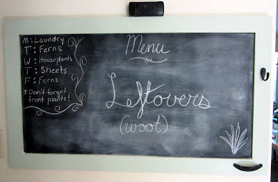
Enter (yet again) the Habitat for Humanity thrift store!  This place is truly a bonanza of awesomeness.  On this particular day I found a huge old cabinet door that they sold me for $1.  I haven't measure it, but it's at least 24x42 inches.  To make my chalkboard I simply taped off the edges and spray-painted the center with chalkboard paint.


Oh, yes, we're having leftovers tonight.  And yes, I'm psyched about it.  Anyway, I used a soft green paint sample that I had from a previous project for the frame.  Isn't that great?!  The little hook and drawer pull are where I (usually) keep a rag and the chalk pieces, respectively.  They were actually bright 'n' brassy when I bought them (that finish was a whole dollar cheaper), so I just sprayed them with some leftover chalkboard paint.  Much, much better than supa 80's golden chic!  Sorry the picture is so crummy, but this part of my kitchen doesn't get very good lighting.


This is a very quick and easy project, with majorly useful results!  I try to write each night's menu on there before my husband gets home so he isn't constantly wondering what/if I'm feeding him that night.  Plus, that eliminates him asking out loud with the result that I answer him and the kiddos demand to eat [insert dinner items here] IMMEDIATELY or they will almost certainly perish from starvation.

The other thing I wanted to show you today is the little set-up I came up with for my wall calendar, and it's actually immediately adjacent to the chalkboard.  I bought this little calendar on Etsy (of course), and I LOVE IT.  Once the year is over, I can cut off the calendar part and have 12 gorgeous food illustrations ready for framing!  Yay :)

The calendar itself is pretty small (7.5x11 inches), so it definitely needed a support team to give it its proper oomph on my wall.  I found a great (if ugly) frame at yet another thrift store for, you guessed it, $1.  I just dry-brushed over the ugly wood with some white primer and it came out great.


I thought the little book page bunting on top was a fun touch, too.  So that's my little kitchen command center, complete with calendar and chalkboard!  I love them both, and they're both totally functional and pretty.  A great combo, if I do say so myself!

Thursday, August 9, 2012

Crafty bucket storage

Happy Friday!  Hope your week has been tremendous.

I just have a quick little project to share today.  I saw this fabulous idea on Pinterest and decided I just had to do in Lily's room.

                                                                            Source: shanty-2-chic.com via Anna on Pinterest


I didn't have any wall hooks like that lying around, so I decided to just use nails and a piece of scrap lumber to make my version.  The only thing I bought for this project was the 3 buckets, which were $1 each at Target.  Since I liked the color already, I didn't even need to bother with spray paint.  Score!

One of our neighbors down the street is constantly throwing out fairly sizable stacks of scrap wood, and I've been eyeing those stacks for months.  I finally broke down a few weeks ago and walked right on down the street with my kids' wagon and filled 'er up with lumber.  No shame!  Stephen watched me through his office window and was very perplexed about what in the world I was doing with the wagon sans children.  Well, that dumpster diving excursion paid off, honey!  Be happy that I'm so resourceful (and that I embrace your cheapness philosophy).

I had originally planned to just paint the wood white and leave it at that, but here's what I ended up with.


Isn't that great?!  I totally love how it turned out!  The buckets were just such a sweet yellow, and I thought a charcoal grey chevron stripe would really set them off.  What do you think?  I just used painters tape to create the stripes, then mixed up some of my acrylics till I found the right shade of grey.


I love them, and so do Lily and James.  Project grand total: $3.  Stephen's just pleased that I finally finished one of my Pinterest-inspired projects! :)

Tuesday, August 7, 2012

Shower curtain rescue

So here's the situation: I have an extremely ugly shower stall in my master bathroom.  The tile color is fine (I actually like it), but it's suffering from a distinct lack of upkeep.  As in, don't get too close or the rust and dry rot may eat you alive.  I have scrubbed that place to within an inch of my fingers' lives, but it just won't clean up.  40 years of neglect by an endless rotation of tenants will do that, I guess.


Shudder.  Sorry to subject you to that.  But take heart, I've found a sorta fix!  Sarah over at Thrifty Decor Chick did a post on her own bathroom and she included a picture of the super cool curtain she put in front of her own less-than-awesome shower stall.  Hallelujah!  I can cover up all that nastiness with a nice ruffly curtain and no one (other than anyone who's read this post...) need ever know what's behind it!  Woo hoo!

Lots of the bloggers I love have used canvas drop cloths to great effect for all sorts of decorating projects, so I thought I'd try my hand with one of those.  I now know why so many people use drop cloths: they're awesome!  After you wash it, the canvas takes on a wonderful, nubby texture, and the color is a really nice taupe.  It ruffles beautifully, too.    Here's the result:


When I went to Target to try to get a curtain rod I discovered they actually make stall-sized shower curtain rods.  Who knew?  I wanted to use drapery clip rings to hang the curtain so I could avoid punching holes into it, but the rings I bought were way too small to slide along the curtain rod.  My solution?


I just took double lengths of jute twine and sewed them to the back of the curtain, then knotted the ends over the curtain rod.  Pretty easy, huh?  It actually looks prettier than the clip rings did!  The loops of twine slide beautifully along the curtain rod, so even my husband likes it.  When I first proposed this idea, he was less than pleased with the idea of the extra 1.00000078 seconds it would have taken to get into the shower in the morning after pulling the curtain aside.  Lame-o.   Here it is pulled back!


I LOVE this project!  It turned out beautifully, and completely covers up all the grodiness I can't clean off that shower.  Have a great day, friends!


Friday, August 3, 2012

Chalk Paint Nightstand Redo, Part 2

Hello again!  I'm back with part 2 of my nightstand redo for you guys!  After the less than stellar results I got from my first finishing attempt:

I repainted her grey and then use some trusty medium-grit sanding blocks to lightly distress in strategic spots.  I think my main complaint with refinish #1 is that it's really overdone, so I used a much lighter touch this time around.  Here's the final product of finish #2!


Isn't that so much better than the zebra-rific version?  I gave the whole thing 1 coat of wax and then added another to the top just for extra protection.  The knobs are the ones we put on there several years ago and I'm not totally crazy about them, but they'll do for now.  I think I may replace them with some clear glass ones, or maybe some of those super cute melon shaped ceramic ones.  Decisions, decisions. 

This nightstand is actually my husband's (and no, he doesn't usually have a fancy teacup, teapot, antique book and linen napkin on there; those were just to make it look perty), but I'll be working on my own this evening.  The chalk paint is amazingly easy to work with and it makes a whole project go so much more quickly.  I love it!  I know exactly what I'll be asking for for Christmas.  Hope you have a lovely weekend!  And here's just one more shot before I go:


Thursday, August 2, 2012

Chalk Paint Nightstand Redo, Part 1

Happy Thursday, friends!  I've been super busy these last 2 weeks, but I haven't forgotten this little blog!  Today I'm going to start telling you about my latest furniture painting project, but before I get started I have to mention the wonderful time I had last weekend.  I and 13 other women had the privilege of attending Shaunna West's (of Perfectly Imperfect) first ever Annie Sloan Chalk Paint workshop at her house.  It was SO MUCH FUN!!  I was so delighted to meet Shaunna and to get to play around with the paint I've been reading so much about.  Shaunna's just as fun and sweet in person as she sounds on her blog, and her house is really stunning.  Her husband, Matt, helped with the workshop and even gave a few of us an impromptu tour of their lovely home.  They were both so welcoming and open with their home.  I can't say enough about the day; it was just so great.  If you're even slightly interested it would be well worth your time to sign up for one of her upcoming workshops.  I promise you'll love it!

As a result of all the chalk paint fun we had, I ended up going home with 2 quarts of that magical paint.  I chose French Linen, which is a lovely warm grey, and Pure White, which is, well, white.  Those 2 combine beautifully for a driftwood effect, so I thought I'd try that out on the cheapo bedside tables we have in our master bedroom.  We get these tables several years ago and slapped a quick coat of flat white latex on them.  Or rather, we did that after I utterly and completely failed to cover them in spray paint.  Imagine trying to paint a laminate table in Florida in July on the tiniest apartment balcony in the world.  Yeah, it wasn't pretty.  Nor were the resultant drips and bubbles in the spray paint.  Aaaaanyway, after we painted them white, we neglected to seal them.  At all.  BIG. MISTAKE.


The accumulated scratches (and dust bunnies) of about 6 years did nothing for the look of these beauties.


Looks a bit tired and sad, doesn't it?  Here's the look I'm going for:


To get that driftwood look that you see on my sample board, you simply paint a coat of grey, then a coat of white.  After they're had time to dry (which isn't that long with this paint, maybe 20 minutes), you just grab a damp rag and rub away the white until you achieve the look you want.  My mom asked me if that means the painted finish could get messed up super easily.  Well, if you don't seal it, that might be possible if you really scrubbed hard, but that's why I always plan to seal my work.  You don't have to on low traffic pieces, though.  It's really durable paint!

Well, I did all my painting and then distressed it with the rag and...I kinda hate it.  I definitely need to work on this finish.  Here are a couple little drummers showing you what I've done so far.


I can't stop thinking that table looks like a zebra.  It's so stripey!  I think I just pulled off too much white and did it in too definite a pattern.  It isn't natural looking enough.  What do you think?  Funnily enough, it looks better in these pictures than in person.  It's not horrible, I suppose, but I don't like it enough to keep it this way.  I'm planning to paint over this finish with another coat of grey and then just use sandpaper to lightly distress around the edges and a bit on the sides and top.  Hence the "Part 1" in the title of this post!  Hopefully I'll like round 2 better!  Thanks, Shaunna, for introducing me to this super fun paint :)  Wish me luck!

Saturday, July 21, 2012

Summer Entryway 2012

I hope you're having a lovely, relaxing Saturday!  We just wrapped up VBS at our church yesterday, so I'm pretty exhausted (not least because of the cold I apparently picked up while on crafts duty!).  I don't have the energy to do much crafting today, so I thought I'd share some pictures of our entryway for this summer.  Yes, yes, I know, summer started a long time ago, especially here in the subtropics.  I'm just slow like that!  Actually, most of this was done several weeks ago, but I added a couple finishing elements recently that I really love. 

The glass top table in our entryway is a piece that we received as a hand-me down from a friend of my mother-in-law.  While it had really beautiful lines, she had done a faux finish on it that just wasn't doing it for me.  Here's what it (and my daughter) used to look like:


The faux finish was pretty uneven and it really didn't highlight the prettiness of the table's legs (which, coincidentally, do a nice job of highlighting the cuteness of Lily's baby legs, don't you think? :) )  I used a light ocean-y blue paint for my re-finish and just hightlighted a little with a dark glaze to pick up the details.


Those pictures also give you a peak at what I've done on the top of the table for this summer, too!  Do you like the table's new look?  I really love it!  It has a much softer look that fits better with our house's beach cottage feel.

So, now that you've seen the base, here's the vignette I've come up with for our entryway this season:


I absolutely love it!  I practically passed out when I saw that perfectly chippy old window in my neighbor's yard during our street's annual sale last year.  The under layer is a fantastic sage green that peaks through the lovely cream on top.  And $5?  Score!  It's very old and heavy, though, so it took some serious drilling to get that baby securely on our wall.  The little bunting I just threw together from some burlap and cotton scraps I have in my extensive (read: excessive) stash.


And I LOVE how that paper bag flower turned out.  I followed Destiny's tutorial from over at A Place for Us with a couple paper grocery bags.  I couldn't be happier with it!


FYI, Destiny's tutorial didn't mention what she did for centers, so I just balled up some leftover bag scraps and glued them in the center of my rosette.  Worked pretty well!

On the table, I've place some of my favorite collected beachy, summery things.  That big chunk of driftwood is actually from a local creek.  Our family was playing there one day a couple years ago and I spotted it.  I desperately wanted to bring it home, so my ever-patient husband lugged that water-logged sucker all the way back to our car, about a half mile way.  Isn't he sweet?


That little piece of plastic fern fell out of an arrangement I was making early this month, and Lily thought it should go right there on the table.

The lantern on the other end of the table is one of my favorites, and I found it at a thrift store for $3.  Can you believe that?!  That big conch shell is actually a replica, but the shells and coral in the glass jar and little silver dish are from various beach trips we've taken.  Oh, and that fantastic green glass pitcher came from Anthropologie.


So there you have it!  Our beachy, cottagey entryway for the summer!  It'll probably stay that way for a while, though, since summer lasts so long here in Florida.  Have a great weekend!

I'm sharing here:
TDC Before and After

Friday, July 20, 2012

Salvaging a bleach disaster

Once upon a time, there was a beautiful $50 Anthropologie top, that made its owner feel extra pretty each time she wore it:


Then one sad day, I got sloppy with some bleach...


*Sob!*  My lovely, lovely shirt is ruined!  I mean, I wear things with lots of stains.  Probably waaaay too many, but I pretend that having kids gives me a free pass.  "Oh that?  Ha ha, my silly kids must have spilled on me again!  What can you do?"  That bleach, though, is a little too obvious even for me.  Ever since I did that I've been hiding that shirt in the bottom of my t-shirt drawer trying hard not to look at it.  So, so sad.

But fear not!  I finally found a way to (partially) redeem my stupid misdeed!  You can't really tell from those photos, but the fabric is a really nice slub jersey that I knew I could do something with.  The other day I came across an old Clinique bonus gift bag (hey, inspiration can come from anywhere, people!) that had a sweet pattern of butterflies and hot pink poppies, and I knew I had a use for my sadly abused Anthro shirt.

Some of my favorite (and best selling) items from my Etsy shop are my pillow covers, so I decided to try my hand at reinterpreting the Clinique design for a linen pillow cover.  Here's what I came up with:


Isn't that so bright and happy?  I love how it turned out!  My daughter saw it on our dining room table, which doubles as my sewing table, the morning after I made it and told Stephen that Mommy had made the prettiest pillow ever.  Why, thank you very much, you discerning almost-5-year-old :)  Here's a closer picture of one of the poppies:


I had fun doing the black stitching around the centers; I think it gives the poppies such a nice hand drawn look.  I just free-hand drew the poppies' shapes onto some of the shirt fabric that I'd backed with Wonder Under (an iron-on product that makes any fabric into an adhesive one).  I then simply ironed the poppies, stems, and center onto the linen and machine stitched them all to give them even more staying power.  This one is available here in my shop, but I love this pillow so much that I may have to make one for us to keep.  That would apparently make Lily happy, too.

So the moral of the story is, even if you do stupid things like ruining one of your favorite items of clothing, all hope is not lost!  You can salvage something from your mess, I promise.  Join the movement!  Upcycle!  (As an aside, I have such a love-hate relationship with that ridiculous word.  The English major side of me gags a little every time I hear/read it, but the creative, crafty side of me really loves the concept.  Alas, until I come up with a better word, I'll have to use that grossly over used one.)

Linking up here:
TDC Before and After